Fixing YUI CSS grid issues with JavaScript and the DOM
Introduction
In the last article I introduced you to the YUI CSS grids and showed how to create a CSS layout by adding the right markup and classes to a basic and valid HTML structure. We ended pointing out some problems of CSS layouts and I hinted that you can use JavaScript to fix those. Well, this is the time and this is the place.
Adding some JavaScript magic
In the last article in this series I’ve come as far as I can go with CSS and grids (well, I could have covered nesting in more detail, but you can have a go at that yourself and – let’s face it, you will use the grids builder like anybody else.) Now it is time to add some JavaScript to work around some layout issues.
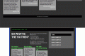
JavaScript can do several things CSS cannot do. Specifically JavaScript can read the size of screen elements and the browser, allowing you to fix CSS layout issues, such as inconsistent column heights. The best example are columns with the same height independent of content. Below I’ll add some content and styles to the grid we defined earlier. The first issue to notice is that, while the columns and everything work out, they do not line up with each other, and are as high as their content, as shown in Figure 1.

Figure 1: The CSS columns by default do not line up, and are as high as their text content.
However, before I can fix that, I’ll have to work around another assumption I made.
Will the template fit?
The doc2 template assumes the browser viewport to be at least 950 pixels wide. If that is not the case, the browser will show a horizontal scrollbar, which is not a nice thing to do to a visitor.
I can work around that problem using the YUI DOM utility. This part of the library helps you access the document, read out dimensions of the browser and elements and set styles reliably across browsers. To fix the problem of the horizontal scrollbar, I can do the following using JavaScript:
Check that the viewport is at least 950 pixels wide If it isn’t, set the id of the main container to doc (which means switching to the 750 pixel wide layout), and if it is, set it to doc2.
The code is pretty simple (check it out in switchtemplate.html.) At the end of the body I add the combined YUI components Yahoo, DOM and Event and my own script.
<pre class="wp-block-syntaxhighlighter-code"><a href="http://yui.yahooapis.com/2.3.1/build/yahoo-dom-event/yahoo-dom-event.js">http://yui.yahooapis.com/2.3.1/build/yahoo-dom-event/yahoo-dom-event.js</a>
<a href="http://switchtemplate.js">http://switchtemplate.js</a></pre>
The YUI include automatically gives us the YAHOO.example namespace, which I use to define the code in switchtemplate.js:
YAHOO.example.switchTemplate = function(){
    var outerContainer = YAHOO.util.Dom.get('doc2') || YAHOO.util.Dom.get('doc');
    if(outerContainer){
        var currentWidth = YAHOO.util.Dom.getViewportWidth();
        outerContainer.id = (currentWidth < 950) ? 'doc' : 'doc2';
    };
}();
I am using the JavaScript Module Pattern (as explained in detail on the YUI blog) to make sure that none of our code is in the global variable space.
I then use the YAHOO.util.Dom.get() method to retrieve the outer container element. I check if this is the element with the id doc2; if that one doesn’t exist I select the one with the id doc instead. I store the element in the variable outerContainer and test if it has been successfully set.
If it has the YAHOO.util.Dom.getViewportWidth() method reads the width of the current browser window. If the width is less than 950 the id of the outer container is set to doc, otherwise it’s set to doc2. The result can be seen in Figure 2:
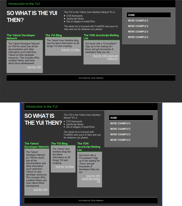
Figure 2: When the browser is less than 950 pixels wide the template switches to the one expecting at least 750 pixels space.
Fixing the sidebar
That took care my assumption of 950 pixels. The next annoyance is the side bar not being as high as the rest of the content. This can also be easily fixed, and my next example – fixsidebar.html – does exactly that.
The logic is to check the height of the yui-main container and set the height of the sidebar to this one. That way the sidebar will span the whole height regardless of its content. You can find out the height of an element from its offsetHeight property, and this is what I use in fixsidebar.js:
YAHOO.example.fixSideBar = function(){
    var outerContainer = YAHOO.util.Dom.get('doc2') || YAHOO.util.Dom.get('doc');
    if(outerContainer){
        var currentWidth = YAHOO.util.Dom.getViewportWidth();
        outerContainer.id = (currentWidth < 950) ? 'doc' : 'doc2';
    };
    var mainContainer = YAHOO.util.Dom.get('yui-main');
    var sideBar = YAHOO.util.Dom.get('sidebar');
    if(mainContainer && sideBar){
        YAHOO.util.Dom.setStyle(sideBar,'height',mainContainer.offsetHeight + 'px');
    };
}();
This checks for the existence of the elements with the ids of yui-main and sidebar, and sets the height style property to the offsetHeight of the yui-main element. In order to set style properties we use the YAHOO.util.Dom.setStyle() method. Once this script has run the side bar will be as high as the main container and look a lot cleaner, as seen in Figure 3:

Figure 3: By reading out the height of the main container and setting the height of the side bar we can make it span all the way down to the footer.
Normalizing column heights
The last little hiccup in my design is that the headings and content boxes in the three column grid are all a different height. This can be fixed using the same trick I used for the sidebar. The only difference is that I need to loop through all of them to determine which one is the highest. The following script (found in fixcolumns.html) shows this solution:
YAHOO.example.fixColumns = function(){
    var outerContainer = YAHOO.util.Dom.get('doc2') || YAHOO.util.Dom.get('doc');
    if(outerContainer){
        var currentWidth = YAHOO.util.Dom.getViewportWidth();
        outerContainer.id = (currentWidth < 950) ? 'doc' : 'doc2';
    };
    var mainContainer = YAHOO.util.Dom.get('yui-main');
    var sideBar = YAHOO.util.Dom.get('sidebar');
    var showCase = YAHOO.util.Dom.get('showcase');
    if(showCase){
        function setMax(collection){
            var max = 0;
            for(var i=0;collection[i];i++){
                var height = collection[i].offsetHeight;
                max = height > max ? height : max;
            };
            for(i=0;collection[i];i++){
                YAHOO.util.Dom.setStyle(collection[i],'height',max + 'px');
            };
        };
        setMax(showCase.getElementsByTagName('h2'));
        setMax(showCase.getElementsByTagName('p'));
    };
    if(mainContainer && sideBar){
        YAHOO.util.Dom.setStyle(sideBar,'height',mainContainer.offsetHeight + 'px');
    };
}();
Note that this functionality needs to be added before the one fixing the sidebar as the overall height of the container might change.
I check if the element with the id of showcase exists and define a function that determines the highest element in a collection. The function does this by reading the offsetHeight of each and setting a max variable to the highest. It then loops through all the elements and sets their height to this max value.
This function is called twice, once for all the h2 elements in the element with an id of showcase and a second time with all the p elements. Once this has run my layout looks clean and aligns nicely, as shown in Figure 4:
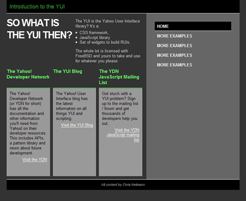
Figure 4: I can fix the height of columns by determining which one is the highest and setting the height of all the others accordingly.
To be continued
These are but a few small examples how you can use the DOM component of the YUI to fix layout issues that aren’t covered by the YUI grids. In my next article I’ll look more closely into the DOM and the event parts of the YUI and go on towards other YUI components like animation and Ajax.
Source: https://maqentaer.com
Satorii yet Another WordPress Theme based on Yahoo! UI
This Satorii is created by and I found it out while searching the google. In theory this theme is close to YUIBlog.com owned YUI Autogrid Minimal that had been around on the Internet for some time.
What I want to do here is to introduce the theme to this “YUI-based WordPress theme development” project
Due to the Arrival of YUI3, I have chosen to continue using YUI2 CSS Grids Layout
I can say that my favourite Yahoo! User Interface (YUI) version 3 or YUI3 has finally arrived. This makes me think what is going to happen with all my work based upon YUI2 grids and javascripts?
I looked into the possibilities of moving foward in line with the progress of YUI itself, but I have come to conclusion that my YUI2 CSS Grids is still needed. One reason is that YUI2 CSS Grids are more familiar to me, and secondly because it has easier way of controlling the layout. Let’s say if I want to make it two sidebars on the left, or on the right, or total page 750px or 950px, it is not very difficult, I am already familiar with it. A third reason is that other people have done some work on implementing YUI Grids into WordPress theme.
When I stand with YUI3 and look at YUI2 then for me it apperas to me that YUI3 is doing better or more robust in its javascript platform rather than its CSS Grids/ or stylesheets. That is why I told YUI3 that I will only use her javascripts, but not the CSS Grids, because I still love YUI2 CSS Grids and I think YUI3 CSS Grids are less interesting for me. Less interesting because they whole concept of grids has changed. It is not only because the names of the grids are totally new, but also they appear not so tidy and easy to control as in YUI2.
I don’t own YUI by the way, therefore, I think actually I do not have any choice left, except make use of YUI2 at the moment, but start thinking and taking steps for using YUI3 for both javascripts and CSS Style-sheets.
I hope YUI people are around and will give their opinions on this. My question now is: “Can I still use YUI CSS Grids until forever?” Or in other words, “Can I still call YUI2 library at their original URLs, or should I change to new URLs?”
I hope anybody who reads this will at least comment on this.
Thank you
KOTEK@Tribesman
Related articles
- “obandes” WordPress Theme: YUI(Yahoo User Inter face) Grid layout support, 2column fixed and fluid layout (yuiwp.wordpress.com)
- YUI 3.14.0 Released (yuiblog.com)
- [CSS Grid Layout] Percentages of indefinite sizes should compute to “auto” (chromiumcodereview.appspot.com)
- YUI After Hours (yuiblog.com)
- YUI Weekly for December 13, 2013 (yuiblog.com)
“obandes” WordPress Theme: YUI(Yahoo User Inter face) Grid layout support, 2column fixed and fluid layout

Obandes WordPress Theme using YUI CSS Grids
It supports Post format image support Zoom it API. This theme supply your happy blogging From beginners to a specialist.
The Tags of this theme are: two-columns,right-sidebar ,fixed-width ,custom-header, custom-background, flexible-width, custom-menu, threaded-comments, sticky-post, translation-ready
The theme is at http://www.tenman.info/wp3/obandes/. Here it says,
This is sidebar width and position changeable 2column html5 theme. You can embed big size photo easy and can get drag and drop view when using post format image.
Post format link make a website thumbnail create automatically. And index page have post format group view.Some category has special layout e.g blog, gallery. All of view keep WEB standard.
This theme has style sheet editor for background ,color and border. Layout keep clean and not broken when you delete all this textarea.
This theme is the one such as palettes and paintbrushes often devised for the artist.
I have tested this theme and it has very complete Theme Options on Admin page.
YUI Niceforms
FreshCut is proud to present YUI Niceforms (v0.1), an easy to use and highly configurable YUI plugin to give most form controls a modern look that is consistent across all major browsers. Based on Niceforms by Lucian Slatineanu.
YUI Niceforms is licensed under a Creative Commons Attribution-Share Alike 3.0 United States License. 
Based on a work at www.emblematiq.com.
Looking for a Theme Library for YUI CSS Grids and Layouts
Re: Looking for a Theme Library for YUI CSS Grids and Layouts.
Posted: Mon Oct 26, 2009 1:38 am
+0- Have a look at http://github.com/tylerhall/yui-app-theme/. That’s the only project I’m aware of.
Also YUI App ThemeYUI App Theme is a generic, skinnable layout for web applications. …. This project is based on the great idea and design work done by the web-app-theme … http://clickontyler.com/yui-app-theme/
YUI Based and Multicoloured "raindrops" WordPress Theme
The description of this theme says it all:
This theme file has the automatic arrangement of color function in specifying the layout customizing function and the reference color by Yahoo User Interface. The color can specify the tradition color and the American tradition color of Japan by the name. An automatic arrangement of color and the layout can be changed to the expression who you further seem by your instruction.
This theme was tagged:
Tags:black, blue, gray, brown, green, orange, pink, purple, red, silver, tan, white, yellow,dark,light,one-column,two-columns,three-columns,four-columns,left-sidebar,right-sidebar ,fixed-width ,flexible-width, custom-colors, custom-header, custom-background, custom-menu, editor-style, theme-options, threaded-comments, sticky-post, translation-ready, post-formats, featured-images
When I tried to implement this theme, it is pretty complicated as it has its own framework that could not help me to adapt it to my favourite “Hybrid” WordPress Theme by Justin Tadlock.
You can access this theme here: http://www.tenman.info/wp3/raindrops/ and here is the author URL: http://www.tenman.info/wp3/
Related articles
- Twordder WordPress Theme: Fully YUI and Twitter Based Theme (papuawp.wordpress.com)
- YUIConf 2012 Talk: Jeff Conniff and Tilo Mitra on the Future of YUI CSS (yuiblog.com)
- Yahoo! Experts Warn Users of SWF Vulnerability in YUI 2 (news.softpedia.com)
- YUI 3.8.0 – Y.Color, Templates and more! (yuiblog.com)
Twordder WordPress Theme: Fully YUI and Twitter Based Theme
I just came across with this theme called “Twordder” by John Turner.
In this theme’s Tag, Turner says: Twitter inspired theme. Twordder is more of a framework than just a theme. You choose your layout, colors and background image. Features Include: Custom Background, Sidebar, Text, Links,and Sidebar Border Colors, Automatically pull color palettes from ColourLovers.com, Custom Background Image, Custom Logo, Custom Page Width, Left or Right Sidebar, Customize Sidebar Width, Rounded Corners in Firefox, Safari, and iPhone, Drop Down Menu Support, Facebook Connect Support, Threaded Comments, Gravatar Support, Microformats, Sticky-Post Class Support. Widgetized Blog Header, Footer and Page Sidebar. Theme by johndturner.com
In his own website, John says:
Twordder is a Twitter inspired WordPress theme. My current theme is an example. Features Include:
- Custom Background, Sidebar, Text, Links,and Sidebar Border Colors
- Automatically pull color palettes from ColourLovers.com
- Custom Background Image
- Custom Logo
- Custom Page Width
- Left or Right Sidebar
- Customize Sidebar Width
- Rounded Corners in Firefox, Safari, and iPhone
- Drop Down Menu Support
- Facebook Connect Support
- Threaded Comments
- Gravatar Support
- Microformats
- Sticky-Post Class Support
In fact John has moved his website from johndturner.com to http://www.seedprod.com/ Perhaps this is why WordPress says
This theme hasn’t been updated in over 2 years. It may no longer be maintained or supported and may have compatibility issues when used with more recent versions of WordPress.
In this http://wordpress.org/extend/themes/twordder, WordPress says:
Twitter inspired theme. Twordder is more of a framework than just a theme. You choose your layout, colors and background image. Features Include: Custom Background, Sidebar, Text, Links,and Sidebar Border Colors, Automatically pull color palettes from ColourLovers.com, Custom Background Image, Custom Logo, Custom Page Width, Left or Right Sidebar, Customize Sidebar Width, Rounded Corners in Firefox, Safari, and iPhone, Drop Down Menu Support, Facebook Connect Support, Threaded Comments, Gravatar Support, Microformats, Sticky-Post Class Support. Widgetized Blog Header, Footer and Page Sidebar. Theme by johndturner.com
PHP Ease YUI Class Based WordPress Theme
This WordPress theme framework is a custom implementation of our Page class. Tailor made to simplify the process of creating a WordPress theme, while giving you total flexibility and control afterwards. This class will completely separate your page’s content from it’s layout, freeing you from establishing an ugly foundation of inflexible divs. This framework is the cure for the common divitis.
The PHP Ease WordPress Theme Framework is somewhat stylish in it’s own right, but if you don’t make any changes to suit your fancy then you’re not seeing the big picture. Making changes with this framework is so easy, you’ll be a professional WordPress Theme Designer in no time. I have prepared a sample Child Theme that you can use for your own personal playground.
The WordPress Theme Framework that this author develops is quite interesting. He uses classes for each function.
Latest Posts
-
Fixing YUI CSS grid issues with JavaScript and the DOM
Introduction In the last article I introduced you to the YUI CSS grids and showed how to create a CSS layout by adding the right…
-
Satorii yet Another WordPress Theme based on Yahoo! UI
This Satorii is created by Felipe Lavín Z. and I found it out while searching the google. In theory this theme is close to YUIBlog.com…
-
Due to the Arrival of YUI3, I have chosen to continue using YUI2 CSS Grids Layout
I can say that my favourite Yahoo! User Interface (YUI) version 3 or YUI3 has finally arrived. This makes me think what is going to…
-
“obandes” WordPress Theme: YUI(Yahoo User Inter face) Grid layout support, 2column fixed and fluid layout
It supports Post format image support Zoom it API. This theme supply your happy blogging From beginners to a specialist. The Tags of this theme…
 YUI, WordPress.com & WP